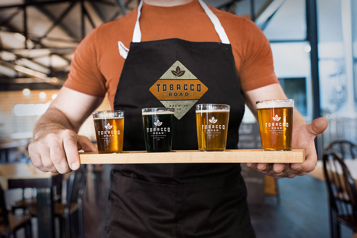
Tobacco Road Brewing
A little over 10 years ago I designed a logo for Tobacco Road Sports Cafe, and over the years Tobacco Road as begun developing their own beer. So when it came time to bring this brand to life while retaining some of its history they hired me one more time. Here’s the final marks along with some of the process.
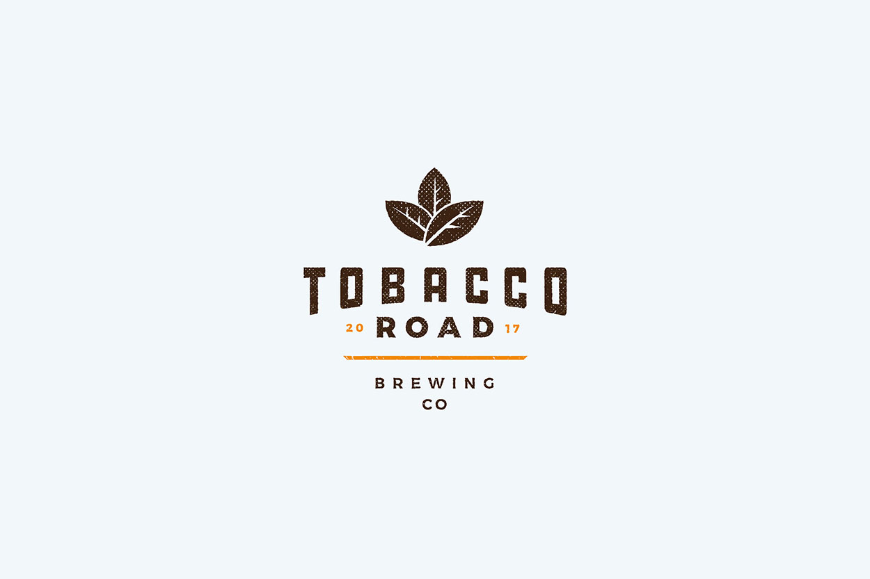
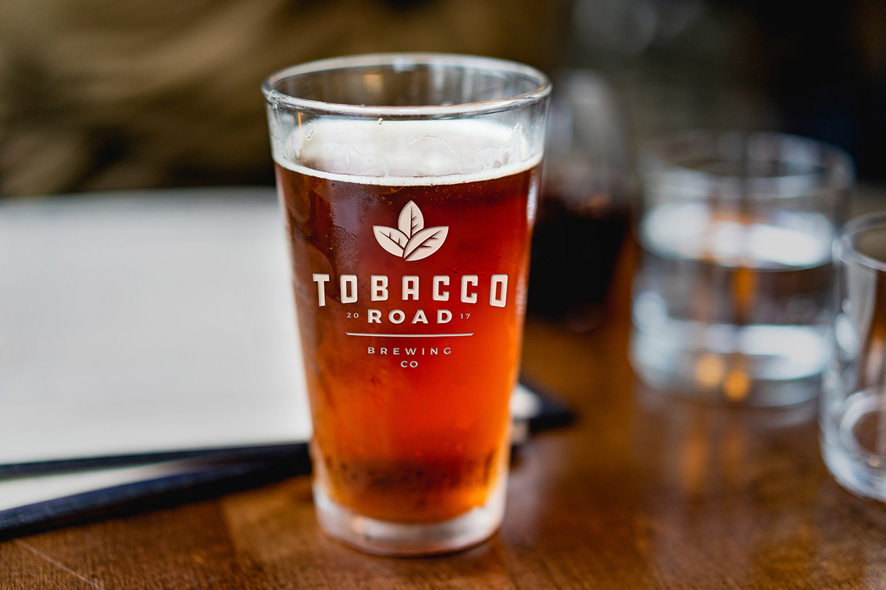
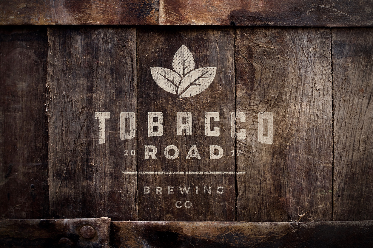
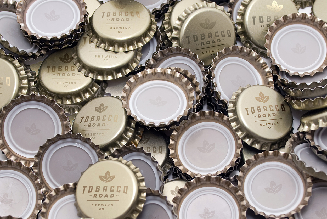
The mark resonates with old-time Tobacco packaging. It brings in the tobacco leaves from the past mark as an icon, but the type has a more modern approach and creates a diamond shape that holds up with or without the badge shape.

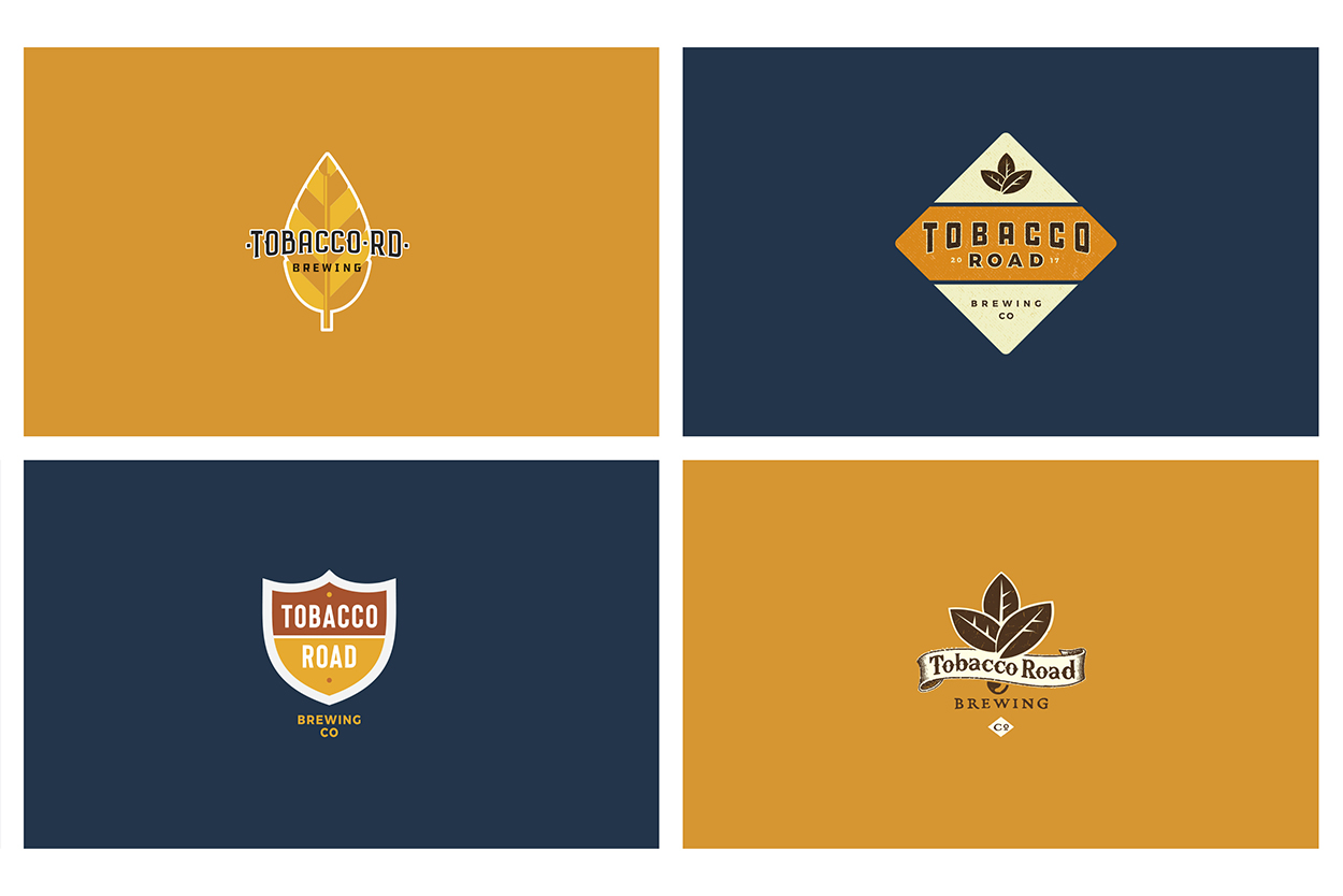
Below are a few variations of the marks I showed. Some lean more into the original mark like the bottom right and some bring in highway imagery.